In the ever-changing landscape of web design, consistency and efficiency are essential. One of the most powerful tools to achieve these goals is a design system.
But what exactly is a design system, and why should you invest in one for your website? Let’s explore the benefits and reasons why a design system is not just a luxury but a prerequisite for a sensible and proactive approach to web development.
Lessons in chemistry
In his book Atomic Design, the US web designer Brad Frost applies a simple chemistry concept to web design and development: he observes that user interfaces tend to be composed of the same patterns and building blocks, in the same way all matter in the universe breaks down into atomic elements.
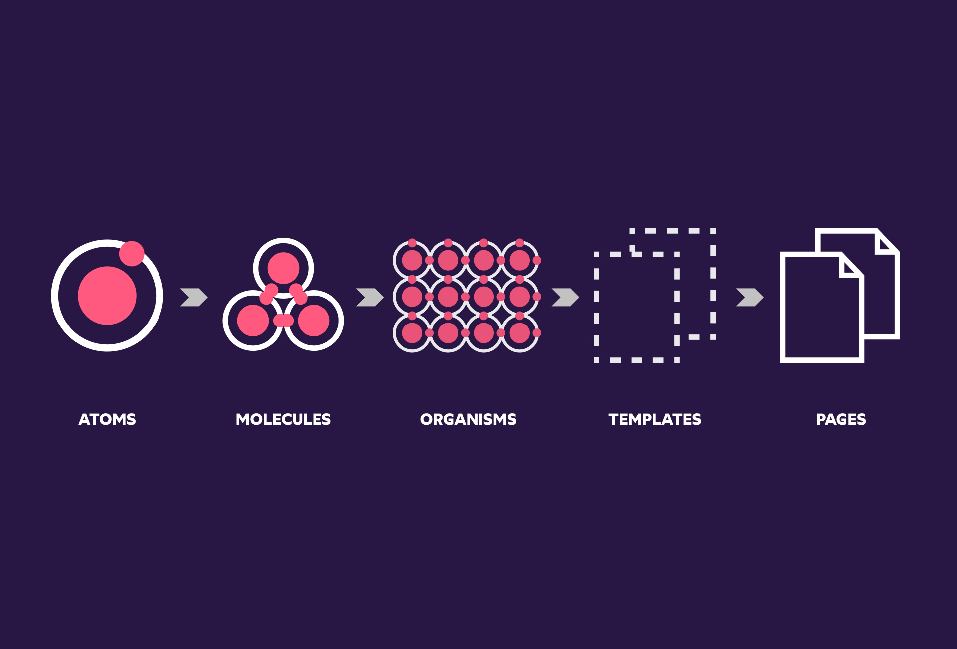
With this basic concept in mind, Brad Frost highlights the need for a deliberate and organised framework when designing and developing user interfaces. In his book, he introduces the atom design methodology as a way to create and maintain robust design systems.
What is a Design System?
In much simpler terms, a design system is a comprehensive library of reusable components, patterns, and guidelines that dictate the visual and functional elements of a website or application. They’re the building blocks that allow teams to build interfaces at scale whilst ensuring brand identity and user experience aren’t jeopardised.
It typically includes:
Design principles
Those are the core values that guide design decisions and keep your entire team on the same page as you progress through the design process. Those values should reflect your culture and allow for the original intentions of the project and user needs to be satisfied.
Style guide
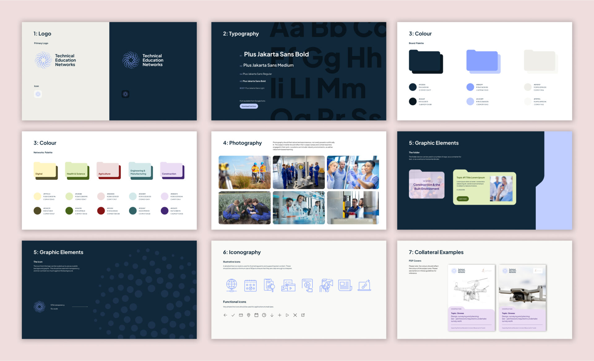
This document outlines the brand’s online identity specifying visual standards, colour palettes, typography, and iconography. As well as establishing a uniform visual identity for the website, the style guide supports a consistent and smooth user experience.
Part of our work with the Technical Education Networks was to develop a visual identity as well as a website for their newly created programme. After some initial discovery work to understand the organisation’s goals and audiences, we created a comprehensive style guide to set out the standards for the brand’s aesthetic and its applications for the web.
Component library
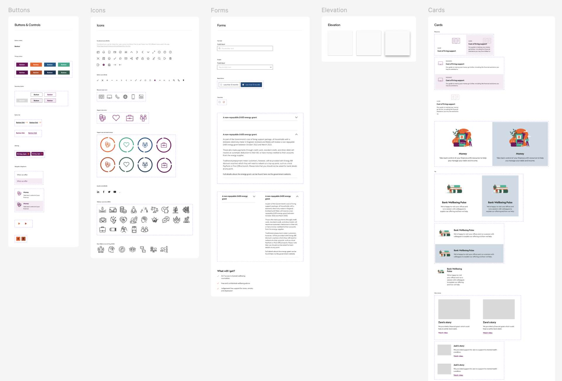
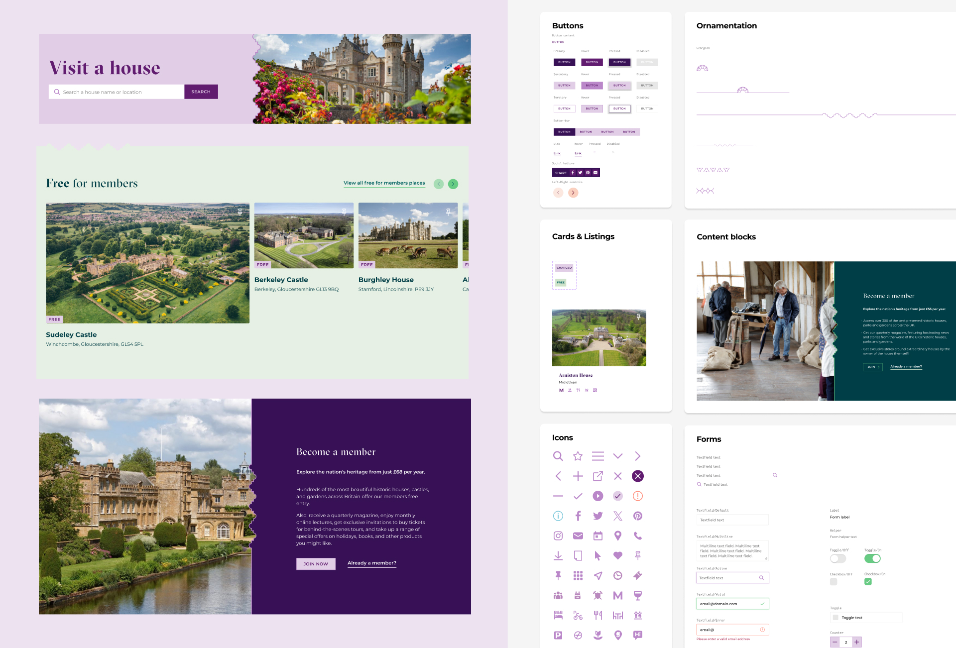
Also referred to as UI library or UI kit, the component library is a collection of pre-designed, reusable elements like buttons, forms, and navigation menus. By keeping those elements organised in one single resource, designers are able to create complex and coherent designs more efficiently.
Patterns & templates
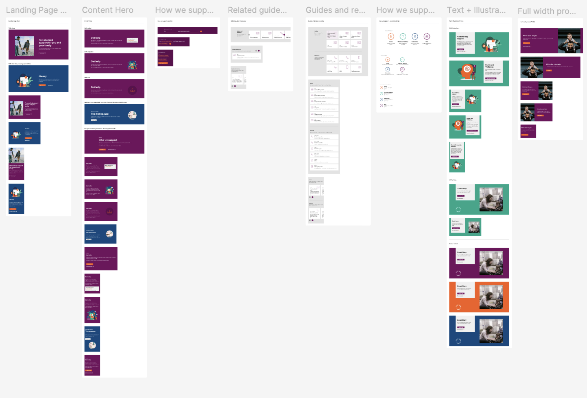
Those are tried-and-tested ready-to-use building blocks that solve common design challenges. They are customisable and can therefore be aligned with the overall user experience and any given project’s unique goals.
At this point in our design process at Pixel Fridge we start bringing things together into configurations that resemble actual page layouts. For this purpose, we create a library of the building blocks (also known as ‘rows’) that will be re-used and adapted across the website as we design all the pages for different device sizes.
When working on the redesign of the Bank Workers Charity website, this was a good stage for us to start sharing the visuals with stakeholders as they started to resemble actual web layouts.
Documentation
This is a set of detailed instructions and guidelines on how to use and implement components and patterns, essential for effective knowledge transfer. From project requirements and technical specifications to testing strategy and approval process, these essential recommendations serve as a blueprint for consistent, smooth and therefore cost-effective practices throughout the design and development process.
Why your website needs a design system
Consistency across your site
As you may have guessed by now, one of the primary benefits of a design system is consistency. A design system ensures that all elements of your website adhere to the same set of guidelines and principles as one single source of truth. This uniformity enhances the user experience by making your site easier to navigate and visually coherent. When users encounter familiar patterns and elements, they can interact with your site more intuitively.
Efficiency in design and development
Design systems streamline the workflow for both designers and developers. Instead of reinventing the wheel for every new page or feature, teams can reuse existing components and patterns. This not only speeds up the design and development process but also reduces the chances of introducing errors or inconsistencies. With a design system, you can focus on solving unique problems rather than reworking basic elements, therefore creating bespoke yet intuitive experiences for your user.
Scalability
As your business grows, so do the complexities involved in maintaining your website. A design system provides a scalable framework that can easily accommodate new features and updates. By following established guidelines and using reusable components, you can expand your website without diluting your brand identity or compromising on quality or consistency. This is especially important for large teams or projects that evolve over time.
Enhanced collaboration
A design system encourages better collaboration between designers, developers, and other stakeholders. With a shared set of guidelines and components, everyone involved in the project has a clear understanding of how to achieve the desired outcome. This alignment reduces miscommunication and ensures that everyone is working towards the same goals. It also simplifies onboarding for new team members, as they can quickly familiarise themselves with the established system.

Improved user experience
Consistency isn’t just about aesthetics; it plays a crucial role in usability. A design system helps create a seamless experience for users by providing predictable and intuitive interactions. When users encounter familiar patterns and elements, they can navigate your site more efficiently, leading to higher satisfaction and engagement. A well-designed system also ensures that your site is accessible to a wider audience by adhering to best practices in usability and accessibility.
Cost-effective maintenance
Maintaining a website can be costly, especially when dealing with inconsistencies and redundant work. A design system minimises these issues by centralising design elements and guidelines. When updates are needed, you can make changes in one place, and they will automatically reflect across all instances of the component. This approach reduces the time and cost associated with maintenance and ensures that your website remains up-to-date and functional.
Future-proofing
The digital landscape is constantly evolving, and so are design trends and technologies. A design system provides a framework that can adapt to these changes. By adhering to a set of well-defined principles and components, you can more easily integrate new technologies and design trends without overhauling your entire site. This adaptability helps future-proof your website and keeps it relevant in a fast-paced environment.
We at Pixel Fridge often add features after launch, or adapt things following user testing or feedback. Because we use design systems, this kind of incremental approach is much easier and saves a lot of time. For example, as part of our ongoing work with Historic Houses, we recently identified some users experienced frustration when searching for houses to visit. A quick-win solution to this problem was to introduce a new ‘Visit a house’ landing page in order to promote featured properties and curated content in a more appealing way. Being able to adapt building blocks that were readily available in the design system meant we created this new page quickly and in keeping with the existing brand aesthetic.
Conclusion
Investing in a design system is more than just a design choice; it’s a strategic decision that can significantly enhance the efficiency, consistency, and overall quality of your website. By implementing and maintaining a design system, you not only streamline your workflow but also create a more collaborative framework and a more cohesive and user-friendly experience. As the web continues to evolve, having a robust design system in place will ensure that your website remains agile, adaptable, and aligned with your brand’s goals.
If you’re looking to optimise your website’s design process and user experience, you don’t need to memorise periodic tables but a design system might just be the game-changer you need.
Further reading
When do we need a design system: an interview with Brad Frost
Building a visual language: Behind the scenes of our Airbnb design system
Great design systems examples
Salesforce Lightning Design System
The post Why your website needs a design system appeared first on Pixel Fridge.